Who said that those of us who do hand lettering should always strive for perfection? It’s true: I usually look for uniformity and regularity when doing calligraphy. But sometimes I like to just “let go” and scribble my letters! That sounds like fun, doesn’t it?
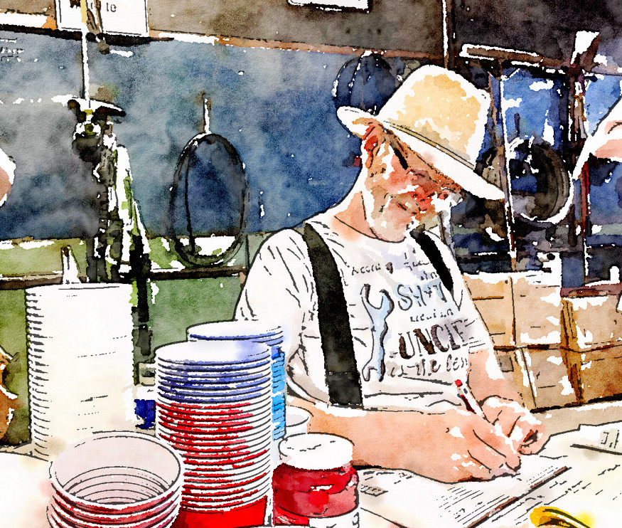
This whole thing was inspired by a photo I took of my uncle, with his pen in hand, who was doing some bookwork in his workshop (and his workshop is hardly fit for polished and perfect calligraphy or hand lettering!). I ran the photo I had taken of him through an app called “Waterlogue” on my phone – and I loved the result! If you are interested, here’s a link to the Waterlogue app. You can also find it on the App Store.
I then printed the “waterlogued” photo onto a piece of watercolour paper, leaving a space at the left for a short message.
Even when scribbling, I tend to think the process through before putting Sharpie to paper. In this case, I first hand lettered my text with a pencil on the watercolour paper. Next I drew over the letters with an extra fine black Sharpie, then I re-traced over some parts with a fine Sharpie. After that, I erased my pencil lines, added some “barbed-wire” effects and a pseudo-frame. Finally, I painted the colour over top of my writing. You can see the process in the short video, below.
Rough letters, like the ones in this birthday message, happen to be the style of the very first lesson in my “Fun with Hand Lettering” course. Other styles include : puffy, poppin’ plain, making waves, Scottish architect, and more! No, you probably won’t find any of these styles catalogued in official documents about hand lettering – but I assure you, they are all fun to do!
If you’d like to see more about the “Fun with Hand-Lettering” class, follow this link.